Shipping Night-Friendly UX Your Shoppers Actually Use

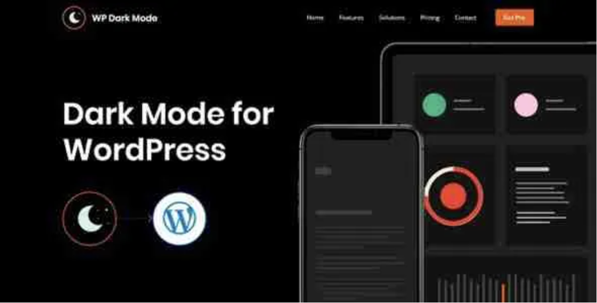
When people ask for “dark mode,” they’re not asking for a trendy paint job. They want lower visual fatigue at night, a calmer reading experience on mobile, and a store that feels up to date without turning every page into a design experiment. This guide shows how to roll out WP Dark Mode Ultimate – The Best WordPress Dark Mode Plugin on a real WordPress + WooCommerce site—quickly, safely, and with guardrails your editors can live with.
What success looks like (so you know when to stop tweaking)
- Respects the user’s device (
prefers-color-scheme) but also offers a clear, accessible toggle. - Keeps the catalog readable: product tiles, sale badges, and the mini-cart remain legible and on-brand.
- No layout shift: images, icons, and logos don’t invert into mud.
- Checkout stays boring (in a good way): totals remain visible; error states remain high-contrast.
- Zero heroics for editors: a saved “Dark Mode Toggle” section and a palette that’s easy to maintain.
- Measured, not guessed: a post-launch bump in late-night session duration, lower bounce, and fewer “too bright” complaints.
If you hit those six, you’re done. Anything beyond that is art direction—not launch-critical.
Why WP Dark Mode Ultimate fits real stores
WP Dark Mode Ultimate solves the two hard parts most teams ignore:
1) Palette logic: It gives you tokenized color roles (backgrounds, surfaces, borders, emphasis) instead of one monolithic “dark.” That keeps copy readable and cards distinct.
2) Selective exclusions: You can keep product photos, logos, and brand images true to their actual pixels, avoiding muddy inversions.
On top of that you get: device-respecting auto mode, a11y-friendly toggles, WooCommerce awareness, and CSS variable hooks for teams that want to go deeper.
A simple rollout plan (one weekend)
Friday evening — Prep (60–90 minutes)
Define a tiny token set:
bg(page background),surface(cards, modals),text(primary/secondary),accent(links/CTA),border(dividers),success/warn/danger(status).
- Inventory brand assets (logos, badges) and mark which must not invert.
- Note your five highest-traffic pages (Home, Category, PDP, Cart, Checkout).
Saturday — Implement (3–4 hours)
- Install and enable dark mode with Auto (system) + Manual toggle.
- Place the toggle in the header (mobile first), add a footer duplicate for long pages.
- Exclude product images, logos, and ratings stars from inversion.
- Apply the token palette; verify type contrast (AA minimum).
- Reserve image ratios to avoid CLS; keep motion at “subtle.”
Sunday — Polish (2 hours)
- Test the five pages in low light on a mid-tier phone.
- Validate forms (focus, errors) and mini-cart legibility.
- Ship a short “We added dark mode” post with a one-click toggle hint.
- Start a two-week experiment: track dark-mode usage, session length (22:00–06:00), and checkout completion.
Launch. Learn. Iterate.
Placement patterns that just work
- Header toggle (icon + text on desktop; icon only on mobile with aria-label).
- Footer echo for scrollers; it doubles as a discoverability hint.
- First-run nudge: a single, dismissible tip—“Try dark mode”—only for users in bright environments at night.
- Remember choice: store preference so the site never “flashes” modes on return.
Avoid modal pop-ups or auto-switching mid-session; you’ll earn complaints you don’t need.
One honest limitation to accept
No plugin can guess your brand’s exact aesthetic. The last 10%—icons, charts, edge-case pages—will always need a human pass. Budget two short sessions after launch to tighten these, and you’ll avoid turning dark mode into a never-ending project.
A quiet note on sourcing
Keeping staging and production aligned (same plugin version, same settings) prevents “nightly mysteries.” If you prefer predictable releases and clean rollbacks while you focus on UX, gplpal is a handy catalogue for version consistency.
Final word
Dark mode is table stakes now—but “table stakes” still deserves thoughtful execution. Ship a sensible palette, keep product photos honest, protect checkout clarity, and put a small toggle where thumbs can reach it. Do those things well and your site stops shouting at night. It starts listening.


